Damion Searls on the Swiked Dress and Color Perception

What is a color?

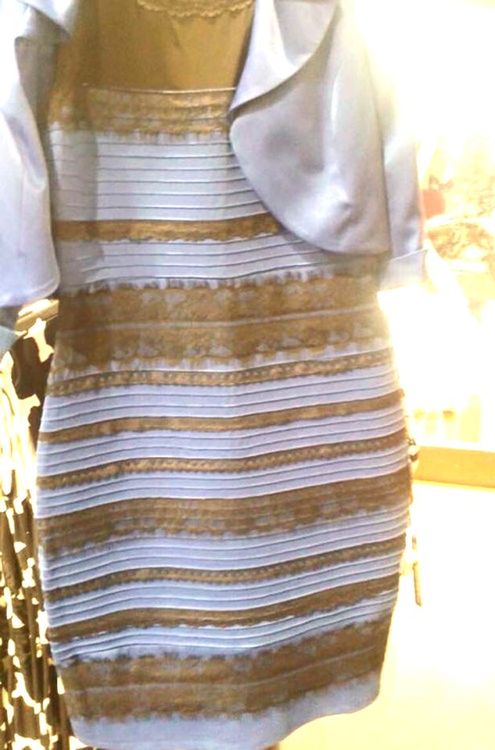
Something closer to the core of our selves than most of us realized, for one thing. You may have seen a certain blue-and-black / gold-and-white dress online not too long ago… Other people seeing it the wrong way seemed totally incomprehensible and impossible: they must be lying, or crazy. Taylor Swift nailed it: “I feel like it’s a trick somehow. I’m confused and scared.” Almost everyone is less indifferent to color than they think. Most botanists and zoologists “make so little account of color,” Henry David Thoreau pointed out a hundred and fifty years ago, “because it is so insignificant to them; they do not understand it. But the lover of flowers or animals makes very much of color. To a fancier of cats it is not indifferent whether one be black or gray, for the color expresses character.” It turns out we are all fanciers, all lovers.

So eventually, out of the gazillions of pictures on the web, there would someday be a perfect optical trick, and a Scottish musician user named Swiked happened to post it. How perfect that swike is Scottish for “trick, deceive, betray”—the Swiked dress swiked us. As with the famous duck-rabbit drawing and the Necker cube (the line drawing that juts 3D along one diagonal or another),you can perceive only one version of the image at a time. It isn’t blurry or multiple: you can’t see both at once. The dress locks you in more fully than the cube: it is harder (impossible for many people) to switch perspectives, to recognize the image as ambiguous at all. And, not coincidentally, it’s an illusion not of shape, but of something much more emotionally powerful: color.

image

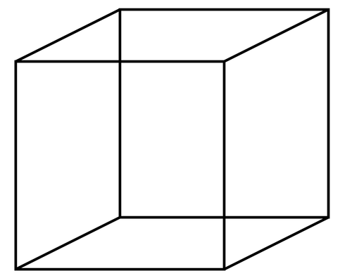
Necker cube, a line drawing with no depth cues.

Here, by the way, is how you can switchhow you see the dress. I saw gold and white, and couldn’t understand how anyone
could see it differently. But go to the best infographic on it, from the NY
Times
, which simplifies the colors to solid stripes and explains how each way of seeing the dress perceives the lighting. Scroll down to the three sets of
bars, and cover the ones on the left with your hand. Look only at the one on
the right, and try to see it as a picture of dark blue bars washed out by a
bright light on the top left, not as lighter bars with a shadow on the bottom
right. See the alternate bars as naturally black, not yellow. Stay there a
while. Then scroll up to the bottom fifth of the image—it will be blue and
black, at least it is for me, and the color swatches to the left will look
blue, not white. I imagine that the reverse approach, looking at the bars on
the left and then jumping to the top of the image, would work for the
blue-blackers.

Color perception is an act of the mind,
not the eye, and one of the easiest ways to prove this is with a phenomenon
called color constancy, which millions more people have heard of this month than
last month. When you look at a sheet of white paper in natural light, it
reflects purplish; in a sunset, it reflects orange; in a dim library, it
reflects gray; but the sheet of paper always looks white. It always is white. It always is really white, because “real” color isn’t
the wavelength of light that your retina perceives. A photometer will read a
blue sheet of paper in gaslight and a brown sheet of paper in daylight as the
same color, but we clearly see the blue as blue, the brown as brown.

image

To a photometer, both circles are the same color. So are both squares.

There’s a tendency to explain this as
something mechanistic, like an afterimage: as though our eyes or brains
mathematically subtracted the ambient light from the object, or recalibrated
what we see using the thing’s “real” color under “normal” conditions as “found”
in our memory. This isn’t what happens, and both experience and experiments prove
it. What happens is more like being able to infallibly put your hand to your
mouth from wherever it is than like mathematically “correcting” for “mistakes.”
It’s not harder to do when we’re tired. The brain doesn’t calculate colors—the
person automatically feels his way into visual situations, just as a musician
expresses herself through the instrument’s physical extension of her body. This
is not a mechanical “motor memory”: when faced with a new instrument, say a
different sized guitar or a pipe organ with keyboards and pedals in entirely
different places, a musician can spend a couple minutes getting used to it and
then play just as proficiently as before. She’s not reassigning a million
neural pathways to new finger movements, she’s getting the hang of it.

Ingenious experiments show that seeing
real color is not mechanical either. If you look through a pinhole at a
part-transparent part-blue wheel spinning in front of a yellow rectangle, the
rectangle will look gray—the mixing of complementary blue and yellow. This gray
is what objectively appears on the retina. But take away the screen and you’ll
see a yellow rectangle behind a transparent blue surface. Perceiving the depth
decomposes the objective retinal color.

Gray paper on a yellow background looks
blue, and a window onto objectively neutral natural light looks bluish from
within a room lit by yellowish electric light. But the yellow background still
looks yellow, while the room’s walls look gray, not yellowish. We are not
mechanically seeing a difference: in the second case we are actively
establishing a new baseline, at the level of the ambient light.

Set up a dim white box and a violently lit
black box so that when you look through a pinhole your eye gets the same
light—you will see the same empty gray in both. But put white paper in the
black box or black paper in the white box, and everything changes: that “same”
gray is now dimly lit white or harshly lit black. Two surfaces with different
reflecting powers create a visual world.

“I say that my pen is black and I see it
as black in the sunshine,” the philosopher-scientist Maurice Merleau-Ponty,
from whom many of these examples are taken, beautifully writes. “But this black
is much less the sensible quality of blackness than it is a dark power that
shines from the object, even when it is covered over by reflections… The real
color remains beneath the appearances.”

image

A black pen, not a pen with a bluish gray lengthwise stripe.

That’s why all the “Science explains the
dress!” that exploded onto the web and TV was useless. Taking a pixel from the
photo and determining its RGB value reveals that the pixel is brownish orange,
but says nothing about the real color beneath the appearances. It proves that
the image “is” gold and bluish white—in fact, the dress was blue and black.
Tilting the monitor is beside the point, as is the fact that monitors display color
differently, because people looking at the same screen can see different
dresses. All the talk of rods and cones, or trichromats and tetrachromats, is
irrelevant, because everyone sees psychologically, regardless of their
biological equipment, and in any case we all agree on blue being blue for most
things in the world, so why not this?

The most annoying explanation of all was
the one about “white balance,” usually accompanying a little video, the one that
went: “Look, if you white-balance the image this way, it looks gold and white,
and if you do it that way it looks blue and black.” Great, and if you filter it
purple it looks purple. Of course you can change how it looks, the question is
why precisely this picture of this dress auto-white-balances itself,
so dramatically, and in two such different ways.

I am not saying we shouldn’t analyze the
image—the Swiked dress is going to end up in the textbooks, along with the
Necker cube and the other classic optical illusions, because figuring out how
it works is going to be fascinating. I am saying we shouldn’t retreat into a
kind of technocratic empiricism that imagines eyeball anatomy or Photoshop will
“solve” the “problem.” (A kind of empiricism which has been, by the way,
empirically disproven in the case of perception.) To explain what makes the
swiking so perfect is more complicated than that.

There’s asymmetrical warfare between the
two ways to see the dress. If you see gold, then the white looks bluish but you
factor that out; if you see blue, then the black looks goldish but you factor
that out—each strength attacks the other side’s weakness. The picture has a
top-bottom asymmetry, too: Even to the gold-whites types, like me, the bottom
looks more blackish; even when I see it as blue-black, the glare on the collar
up top is strikingly yellow, due to the direct reflection of the flash
coinciding with the biggest patch of shiny black. The whole thing is one giant
tipping point.

image

The duck-rabbit illusion first illustrated by Joseph Jastrow.

Vertical imbalances are more decisive to
the eye than horizontal irregularities, which we tend to smooth over as
imperfect symmetry. (The moon looks bigger when it’s lower in the sky; a series
of identical circles in a horizontal ring will look the same size, in a
vertical ring they won’t. This is not true for monkeys, who move through the
world both horizontally and vertically, nor for babies before they learn to
stand upright. It’s not because of perspective, it’s because of how human
beings live.) I don’t think the swike would have worked if the stripes on the
dress were vertical instead of horizontal. I wonder if the thin strip of
black-and-white fabric visible behind the dress in the lower left strengthens
the effect. The image looks bluer to me upside-down. It’s not just that the
photo is backlit: I predict that the illusion depends on the blue of the dress
fabric being an exact complementary color to the orangey yellow of the flash,
or some other relationship that makes the balance perfect. There will be
experiments to test all this.

Scientists, especially psychologists, have
tended to reduce “color” to the hue of a solid color patch—the simplest thing
to design an experiment around—ignoring shimmer, glow, shine, and lighting in
general. The color (of things) and the lighting (of spaces) are not the same,
as proven by the fact that painters can reveal the color of a light source
using shadows and lights on objects, without either depicting the light source
directly or making us see the objects as discolored. What’s easiest to measure
isn’t necessarily truest.

This may be part of why the dress hits so
hard: the color constancy experiments, with their disks and pinholes and so on,
are all very artificial, while judging the color of a dress couldn’t be more
natural. When you remember that color-perception is part of life, not math, that
makes a difference. Once people figure out how the dress picture can be such a
tipping point, there will still be the question of why this or that individual
ends up on one side or the other: maybe it’s about which half of the image
caught your eye first, depending on how you scrolled to it; or what you’d just
been looking at; or your associations and memories. Maybe Kanye sees a lot more
black clothes under flashing cameras, Kim a lot more white—if that’s true, it’s
more important than their respective rods and cones.

What the science fans too often forget is
that seeing is an act of the whole person, not the eye. Massive entertainment
value aside, the dress will not have broken the internet in vain if it reminds
us that there are some things not reducible to numbers but still objectively real
and true.

More Reads
Uncategorized

Believer Radio

Claire Mullen
Uncategorized

An Interview with Kevin Wilson

Vendela Vida
Uncategorized

The Real Horror of Night in the Woods

Ellie Kovach
More