As far as pencils are concerned, I’m a late adapter. I made the switch from a fountain pen (how pretentious, I know) after finishing an essay by Mary Norris on her quest for the ideal No. 1 pencil (contrary to the cabal of No. 2 makers at Ticonderoga, they do exist, and are nigh impossible to find). It shows how deep pencil-freak culture goes that if you’re too occupied to maintain your pencil-point, you have the option of mailing your dulled graphite to David Rees, author of How to Sharpen Your Pencil, to be professionally sharpened. But is there anything more to be said about pencils? Can the pencil be re-conceptualized?

For minimalist pencil-designed Joey Cofone, the answer is an all-caps yes to both questions. Cofone has taken 1st place in the 2013 AIGA CMD-X competition, while Print Magazine named him one of 15 designers under 30 to watch.

The thing to understand first off about Cofone is that he likes simplicity a lot. The co-founder of Baron Fig, a New York-based maker of notebooks, Cofone has recently delved into reinventing the pencil. Or revolutionizing it. At the very least, he’s produced a damn fine instrument to write with and to hold.

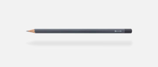
The fittingly named Archer has a design that’s extremely clean-lined, forsaking the ferrule and even the eraser in pursuit of lightweight practicality. It’s also incredibly aromatic.

—Michael Peck

THE BELIEVER: What got you into paper and notebooks?

JOEY COFONE: Several years ago, back at the School of Visual Arts here in New York City, I had realization that changed my life. Walking through the design department and taking a look at my fellow classmates’ tools, I noticed something: each of us was using two tools—a laptop and a notebook—to design. The laptops were all the same, MacBooks, but the notebooks were all different brands, sizes, paper types, and so on. I was intrigued. Why was there ubiquity with one tool but no loyalty to the other?

I went home and checked out my own bookshelf, and lo’ and behold all of my notebooks were different. There was this unspoken search for the right notebook that was going on all around me. Eventually my Co-founder Adam Kornfield joined the mix, and together we talked to thinkers all over the world, asking them one question: What do you like in a sketchbook or notebook?

Out of the five hundred plus cold-emails, we received a whopping 80% response rate. It turns out others were on the same search as us—and they had a lot to say. We used all that feedback to design the first community-inspired notebook, the Confidant, and put it on Kickstarter. At the end of thirty days we sold almost ten thousand notebooks and raised over $150k. That was just over two years ago.

BLVR: How did the name Baron Fig come about?

JC: I had this hankering for the word “Baron.” No idea why, such is life. I took the word to my co-founder Adam and our friend Scott, and told them that it needed a second word. Scott immediately, without hesitation, said “Fig.” Adam and I were confused—what does it mean?—even Scott didn’t know why he said it. Somehow it stuck, but I wasn’t happy with it. How could a company about thinking, about infusing meaning into creativity, not have a name with meaning itself?

For the next few weeks I wrote down hundreds and hundreds of possible names, but none stuck like Baron Fig. Finally, pretty much at wit’s end, I decided to look up the origins of baron and fig. Baron was a symbol of Apollo and Fig was a symbol of Dionysus—brothers that represent order and chaos. The name essentially symbolizes balance, of having the discipline to work hard but also the impulse to play, which is the essence of the creative mindset.

BLVR: What prompted the leap into pencil-making? Were there specific models that influenced the design of the Archer?

JC: I’m a minimalist designer. Hell, I’m a minimalist exister, if there is such a word. I like everything simple, fluid, clear. Clutter and excess drive me nuts. Even when I was a kid, I always wanted things to be just right. I used to go around the house and organize each room as if they were showrooms on display. Lamps squared with the edges of tables, stove tools arranged from longest to shortest, you name it and I was all over it.

The Archer pencil was sort of a minimalist dream come true. I’ve always wanted to design a pencil—they’re like little creative wands—and it took our team over a year to hone in on the right production quality. In the meantime I designed dozens of versions before landing on the Archer you see today, each iteration a little more refined and simpler than the ones before it.

BLVR: Minimalism is definitely a noticeable trait, and it seems like the Archer is something of an ultimate statement of this simplicity. How does one go about re-conceptualizing the pencil?

JC: I don’t know how other designers do it, but I keep iterating until things feel right. Sometimes it’s quick, sometimes it takes 82 versions like the Confidant notebook’s packaging. My goal is to isolate and preserve the best elements, improve the weak ones, and look to my inner self’s gut response to see if the new outcome pleases or not. Rinse and repeat. My old teacher and designer James Victore has a good line about this: “In the particular lies the universal.” Solve your problem—and delight yourself—and you’ll do the same for others.

BLVR: The Archer, besides its other greatnesses, smells so good I have to pause what I’m doing and take a hit. How much wood did you have to test/sniff to make the best choice?

JC: I hear you. We try to take our hits when no one is looking. Sometimes you can find Adam near the stock shelves face-deep in a box of them. It’s definitely an issue.

BLVR: You mentioned earlier this idea of ubiquitous loyalty when it comes to laptops, etc. Pencils are sort of marked by promiscuity—once you’re done with one, you just pluck another from the box. So how do you hope to gain that kind of loyalty with the Archer?

JC: Think of a pencil being more like a cup of coffee rather than a pen. We all find our favorite coffee and stick to it. Sure, the cups run out, but there’s always another one waiting—and you know it’s going to be just as good as the ones that come before it. Quality, reliability—they’re both extremely important in designing a consumable, especially a tool that helps us do our work or hobby.

BLVR: For pencil nerds like myself, how does the Archer differ, and improve upon, something like the Palomino Blackwing?

JC: I get asked this a lot. We put major emphasis on community feedback, and design accordingly. Since we launched Baron Fig we’ve tweaked and redesigned every product directly based on the ideas that come our way from our customers. When we say “Designed by the community,” we mean it. As far as the Archer goes, they’ve been a requested product since day one. Each Archer is extremely high quality, better than anything available at their price point of $15 per pack. And, if I do say so myself, sexier than any pencil, period.

BLVR: It’s definitely a sexy pencil.

JC: Thank you.

BLVR: Pencils, packaging—it’s so minimalist it’s sans-serif, without a stray line in sight, the Phillip Glass of writing implements (I could go on). But I do find myself a little thrown off by the lack of an eraser. Was there a debate to excise the eraser?

JC: Well said. Since launching the Archer I’ve been asked this question often—”Why did you remove the eraser? What’s your thinking?“—as if I’ve committed an atrocity. There’s a disconnect, though, between how people say they feel about erasers versus how people actually feel about them. When’s the last time you used an eraser on a pencil and thought to yourself, “Damn, this eraser is great”? I don’t think it happens. They’re pretty much crap, every one seems to leave marks on the page, gets dirty and blemished, and in the end delivers an underwhelming experience.

So I nixed it. Boom, goodbye eraser at the end. With that out of the way now we can actually deliver a quality eraser on the side, one that doesn’t mark up your page and isn’t limited to the lifespan of the pencil itself.

BLVR: What do you see the Archer going into the world to achieve?

JC: Everything. Imagery and language are some of the oldest and most glorious technologies known to man. Technology? What? Yes, technology. But I’m digressing—what do I hope for the Archer to achieve? For these pencils to be the vehicles of communication, of images and words, that affect the world. Ideas are powerful, writing instruments are the means by which they’re communicated. On our site, at the top of the Squire pen page, it explains that a writing instrument “…grants the power to move entire nations, to touch people’s hearts and souls—to make something from nothing.” And I mean every word of that.

More Reads
Uncategorized

Electric Blue: Kim Wood on David Bowie

Kim Wood
Uncategorized

Something Happened on the Day He Died: Jordan A. Rothacker on David Bowie

Jordan A. Rothacker
Uncategorized

Thomas Bernhard Speaks: Jim Knipfel on Thomas Bernhard: Three Days

Jim Knipfel
More