image

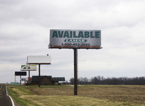
Like the motels and fast-food joints along America’s interstate system, billboards are a ubiquitous roadside feature, a revealing (if archaic) format that refuses to disappear in a digital age. In Missouri, where there is a billboard surplus, these low-budget advertisements can seem like a back-and-forth shouting match in the culture wars, with their commentaries on sex, gambling, firearms, unions, and religion.

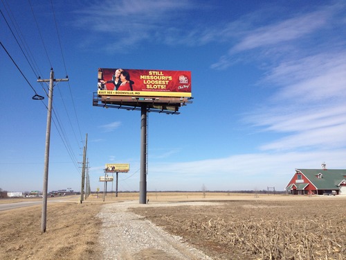
The “I-70 Sign Show” is a yearlong event launched in April that engages the Missouri landscape by exhibiting art on an interstate billboard near Columbia, halfway between St. Louis and Kansas City. Six artists are on the main board for two months; then their work rotates to an available board elsewhere on the interstate for another two months, a different location each time. I talked with “Sign Show” organizer Anne Thompson, an artist and writer living in Columbia, about her curatorial agenda.

—Joe Marianek

image

I. THE BILLBOARDS ARE THE SCENERY

THE BELIEVER: How did Missouri become a billboard capital of the U.S.?

ANNE THOMPSON: It goes back to the Kennedy Administration, when the interstate was new. There were federal subsidies to regulate signage, and Missouri turned those down. Since then—and I’m really simplifying—there’s been this contest between highway-beautification efforts and a powerful ad-industry lobby with money and political clout. About 15 years ago, when it looked like a regulation law might pass, billboard companies went on a construction binge because existing signs would be grandfathered in. Going by state transportation data, which isn’t that current, Missouri has at least 15,000 billboards, which—allowing for states with no billboards (like Maine) and states with lots (like Florida)—winds up being roughly five times the national average.

BLVR: The result of this history is a surplus, which means affordable space and a message blitz—porn, abortion, casinos, fast food, traffic-court lawyers, Christianity, fireworks…

AT: Totally, all that and more. And the situation is especially evident along I-70, the cross-country artery that bisects the state. The land is relatively flat and there’s not much there except farms and truck stops. The billboards ARE the scenery. So the “Sign Show” takes the perspective of a 1970s-era land-art project, something that addresses a given condition in a neutral way and has a site-specific integrity—it’s not arbitrary, like putting art on a billboard to pretty-up a construction site, or generalized, like anti-capitalist campaigns to confront big business or expose the mendacity of advertising.

BLVR: Was your objective to subvert the “real” billboards for shock value or was it more to force a conversation with the unsuspecting masses on the road?

AT: Subversion is definitely a goal, though not for “shock” value. To try to out-shock some of the existing billboards would mean selecting work that would most likely offend someone, given the conservatism in this part of the country. And I didn’t want “offensive art” to hijack the point of the project. That dynamic often allows people to shut down from having to engage with a project’s real objective. So my approach was to stage something subtle—to use artwork to join a conversation and critique it at the same time.

 image

II. IT’S ALL MEANINGFUL CONTEXT 

BLVR: What criteria informed your selection? The artwork has to stand up visually next to the I-70 billboard onslaught and also be able to comment on it.

AT: Right; all the artists are known for dealing with language, signage, and/or commercial messages. For example, the first four are Kay Rosen, Mel Bochner, Mickalene Thomas, and Kim Beck. Within those parameters, we select an existing image or produce a new work that taps some aspect of the billboard conversation.

BLVR: How would you describe the billboard conversation?

AT: There are moments of weird contrast—like porn ads next to church ads. But those pop out within stretches of really banal stuff, just one sign after another in a kind of monotony. Some businesses rent rows of billboards to create advertising narratives. And many signs go unused. Some have ads for advertising on them, like “put your message here.” Some are just blank. Some of the older ones are wood and crumbling, and are actually beautiful, like ruins, with layers of messages peeling off or fading away to reveal the traces of earlier images.

If you take the entire stretch of I-70 through Missouri in aggregate, the billboards form an ongoing dialogue that changes slightly but always covers the same themes: politics, religion, beauty, sex, food, travel, education, and commerce in general. So my thinking was that by engaging some of these themes I could somehow “claim” all 250 miles of the interstate as art territory—as part of the project—with just the single, main billboard.

BLVR: It’s incredible that one heroic billboard can disrupt 250 miles of signs and stand taller with a carefully chosen message. Do you think that any of these charged issues have been brought forward?

AT: Yes, I hope my billboard has that superpower! I launched the project with this great image by Kay Rosen, a version of her wall painting “Blurred,” from 2004, because it highlights the “red vs. blue” dynamic in the billboard argument and speaks to that aspect of Missouri’s political identity. The piece is just the word “BLURRED,” but “BLU” is in the color blue, the middle “R” is purple, and “RED” is red. Off the bat, the piece calls attention to and enters the billboard smackdown. But it also introduces this elegant and playful idea of a gray area (or, in this case, a purple area), a compromise that “blurs” boundaries and is less easy to identify. Which speaks to another Missourian identifying quality, of stubbornness and wanting proof, the whole “Show-Me-State” thing.

BLVR: Right. And while Kay Rosen’s colorful pun brings new life to a familiar political tension of the heartland, it will be intriguing to see how other artists deal with more delicate topics.

AT: I’m looking forward to putting up Mickalene Thomas’s work, because one of the main themes along the interstate is sexuality, in terms of the female body—porn, but also ads for Hooters, liposuction, and lingerie, and, of course, about abortion. And plenty of ads use sexual suggestion. One of these multiple-board narratives, for a car dealer, goes “Are You Into Europeans?” “What About Asians?” “How about Red-Blooded Americans?” “We’ve Got ’Em All,” and then the dealership name. My favorite is probably this one for a casino that shows a tipsy-looking blonde draped over a guy at a slot machine with the slogan “Still Missouri’s Loosest Slots!” With Mickalene, we’ll use one of her Foxy Brown–type odalisque photographs that merge art-historical and Blaxploitation references. And this is work by a gay woman of color commenting on sexualized representations of the female body. In “high-art” terms, this infiltrates the female gaze into billboard commerce, which I’m fairly confident is a male-gaze-dominated enterprise. Down on the ground, Mickalene’s image could cause some fantastic confusion, because, as things are now, the “Sign Show” billboard is sandwiched between ads for an RV campground and a strip club. It’s possible those ads could change before Mickalene’s photo goes up, but I’m hoping they don’t.

BLVR: I’m sure the campers and strippers wouldn’t mind if you helped stimulate business. On a more scholarly note, how does this project fit within the traditions of both landscape and site-specific art?  

AT: During the “Sign Show” exhibition period (April 2014–March 2015), I’m collaborating with some University of Missouri students on a photography project to document all the billboards on I-70. Obviously, this taps the tradition of people like the Bechers, or Ed Ruscha and Robert Smithson, or Robert Venturi and Denise Scott Brown—we’re looking in a deadpan way at an industrialized de-romanticized landscape. In the end, we’ll produce some form of book. But we’re also going to categorize the billboard messages for an online database, something to contextualize documentation of the artwork for an audience that doesn’t know the region. Ideally, the database will function as a corollary “Sign Show,” making the existing billboards an exhibition in their own right.

BLVR: So, similar to Smithson’s documentation, it will have an afterlife in another less-experiential format.

AT: And Smithson is also relevant because of his ideas around time and decay. The interstate itself complicates elements of time—it has a beginning and an end, but no definite entry or exit, and multiple durations. Some people go back and forth on a tiny section multiple times a day; others drive the whole length but only once, en route to another destination. The billboards reference time in that they change, and some have a natural lifespan, like the duration of the state fair or a gun show. And there’s an entropic, memento mori–type message in the way the billboards vary so much in age and condition—the huge metal billboards are built to last at least 50 years, and they look like hulking industrial monsters, but right next door are the weather-beaten crumbling ones, and you realize they were new once, too. Nothing lasts forever.

BLVR: The proprietors of the businesses have no idea that they’re a critical part of your project. Obviously, they weren’t singled out, but how did you pick your location?

AT: I rented a board 10 miles east of Columbia so the artwork would join a regular billboard rhythm approaching the city but not get lost in the sign clustering that happens around destinations. The thematic nature of the project makes it less crucial for the “Sign Show” board to confront particular messages. The artwork changes every two months, and the surrounding ads could change, too—or not—it doesn’t really matter. It’s all meaningful context.

BLVR: Were there difficulties obtaining permission from the billboard company? 

AT: The billboard company, DDI Media, was completely game. My funding comes from the University of Missouri, so the university’s media-buyer handled my contract, and during that process, they came with the idea of the second board—to rotate each artwork vinyl for a limited time to an empty board someplace else on I-70. That would never have occurred to me, and it’s such a terrific plan, because it puts the project in sync with commerce and gives me even less control over the artwork context in terms of surrounding messages, which is all for the good.

image

III. THE TRANSFORMATIVE AMERICAN SUBLIME

BLVR: This feels like a modern rural beautification project, sort of a DIY WPA. What kind of public feedback have you received?

AT: I like the WPA idea—the project does connect with industry, and work, and commerce. But I can’t call this beautification. I’m not trying to make I-70 more attractive or say billboards are good or bad. The billboards just ARE, and the selected artworks aim to acknowledge that situation. I’ve had people say things like, oh, it would be great if you could put art on all the billboards, but, in terms of the project, that would be terrible. It would remove the “Sign Show” impetus. And to be honest, I’m not sure that “art” on all the billboards would be an improvement. What’s interesting is the art in relationship to the advertising.

BLVR: Have any critics remarked that disrupting the normal flow of billboards is potentially distracting or dangerous? 

AT: I don’t think the art is going to make anyone drive off the road. And some of the existing billboards are already pretty startling. A while ago there was talk about banning “sexy” images—not necessarily because they’re distracting but I think because they offended some people. The debate now is over proposals to digitize the billboards, which really could be distracting. Though making the interstate more like Reno might, in some twisted way, allow it to fulfill its signage destiny: that trajectory is already there.

BLVR: Do you view this project as a comment on the enduring power of the billboard as a commercial canvas and a medium for creative expression? 

AT: I don’t have a strong position here. People in Columbia tend to complain about the billboards as eyesores or something embarrassing. I’ve certainly found the billboards oppressive at times, but this project makes me pay closer attention and at the same time gives me critical distance. The interstate just looks like subject matter now. It’s an opportunity for collaboration—with the artists and also with the billboard company, the advertisers, and the billboards.

BLVR: Are you planning to repeat the project in other heavily commercialized semirural stretches of highway across the US, or elsewhere? 

AT: Maybe, if the art intervention could connect with a specific landscape. I have been working to organize another Midwest highway project called “Abstract Drive-in,” which would be a traveling abstract-film festival at drive-in movie theaters in cities and also semi-abandoned ones out the country. The idea is how the transformative American sublime connects abstract art and cinema and the open road—a kind of Kerouac thing, the trip that exists in both the car and the mind. The screenings would be like “happenings” for an intentional audience but also for random travelers at a distance who would see form and color glowing on the horizon. Of course, drive-ins allow for a more romantic take on highway culture than billboards, which are aggressive, banal, campy, and sort of abject, all at once. Although maybe those qualities somehow add up to a kind of romance. It’s something to think about.

  image

Joe Marianek is a New York–based graphic designer originally from the Midwest.

See more info about the project.

More Reads
Uncategorized

An Interview with Rachel Rabbit White

Erin Taylor
Uncategorized

An Interview with Tao Lin

David Fishkind
Uncategorized

Mario Levrero in Conversation with Mario Levrero

Mario Levrero
More