


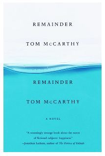
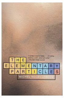
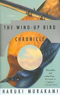
The first time I ever stood in a bookstore and turned over a book to see who designed the cover, I was holding a paperback edition of Haruki Murakami’s The Wind-Up Bird Chronicle. Who was responsible for this amazing design? John Gall. That sounds right, I remember thinking. He sounded like the cousin of Gill Sans. Since then, whenever I come across a cover I like, I turn it over to see if John Gall designed it. Quite often he did. Tom McCarthy’s Remainder is a John Gall design; so is Jeffrey Steingarten’s The Man Who Ate Everything. So is Donald Antrim’s The Verificationist. Here are some others.
Gall has a distinct sensibility: playful, light, intelligent, concise. Other times his covers have a special intensity, as though the book dreamed the cover—as though its soul seeped up from the pages and rested, inkily, there.
He has been in the business for over twenty years. This summer he became Creative Director at Abrams Books. When I spoke with him in his office in the spring, he was still Artistic Director of Vintage and Anchor Books, where he designed covers and oversaw a team of designers who together designed 200 paperbacks a year.
His most ambitious assignment of recent years was a redesign of the entire, 20-title Nabokov backlist. He commissioned a separate designer for each book—including Chip Kidd, Tamara Shopsin and Dave Eggers—with the constraint that they could only use paper and push-pins, and they had to build their cover within a specimen box (a reference to the specimen boxes in which Nabokov displayed his butterflies). Each cover is inventive and unique, yet the series is deeply unified.
He is the author of Sayanora Home Run! The Art of the Japanese Baseball Card.Spine Outis his popular and fascinating book design blog. He teaches graphic design at the School of Visual Arts and lives in New Jersey with his wife and their two boys.
—Sheila Heti
I.THE COVER KIND OF GOES AWAY
BLVR: Your covers seem to communicate, This is a complex, fun, abstract experience. They never suggest it’s going to be a slog. There’s always pop and pleasure in your covers.
JG: I think covers should be fun and pop and smart and inviting and not confusing. They should say: This is going to be an enjoyable experience. I did a cover for a book called Remainder by Tom McCarthy a few years ago. Tom, to me, is part writer part, conceptual artist. We did a photo shoot for his cover so it appeared that the book was being slowly immersed into blue liquid. We had to create a somewhat elaborate setup to get it just right. We sent the author a photo of the studio setup as a souvenier, showing the tripods and lights and water tanks. A year later he wrote back saying he had an argument with some artist friends of his over dinner. They were looking at the studio-set photo and were insisting that it was all a fake setup and that the cover was executed in Photoshop; that the photo shoot was all staged to provide “proof,” like a fake moon landing!
BLVR: And the cover of The Wind-Up Bird Chronicle is just so special. I can’t separate that book from that cover.
JG: That’s funny because people say, Oh, that’s a great cover, but when people say that the cover becomes part of their whole experience of the book, that’s the best thing someone can say. That’s kind of what you’re going for. I mean, you want to catch people’s eye and their attention, but to really have it be a part of the whole experience is pretty special.
BLVR: So the first thing is to catch people’s eye? To get people to buy the book? That’s number one?
JG: When you boil it down. But it depends how you’re catching their eye. It doesn’t always have to be blinding, blaring, glittery stuff. You can be trying to catch someone’s eye for different, more subtle reasons, or trying to reach a different kind of audience, so it depends.
BLVR: I’ve been so disappointed by books that have a character on the cover. That’s something that I’ve never seen you do.
JG: Well, that’s sort of the big no-no. You don’t want to put the character on the cover because you want people to draw their own picture. But I’ve done it. I’ll try it just because you’re not supposed to do it. There’s a glut of stuff out there now, especially with women’s reading group fiction, where people are walking down the street with their backs to the camera, or their heads cut off…
BLVR: For women’s fiction there’s more of an impulse to show a person?
JG: I’m talking in real generalities here. It’s not a directive, but with commercial fiction there is this desire to show some kind of human presence.
BLVR: Your covers seem to work as a diptych. Like, you have the book, which is one work of art, and then you have your design, which is another, and they kind of interact in a way. There’s a loose, interesting relationship between them.
JG: I do like to keep the cover a little open-ended, but not totally open to interpretation, especially with fiction. The diptych idea is interesting. I can imagine the experience as passing from one frame to another. I like the cover to be able to stand on its own and be part of the book. Different planes of experience.
BLVR: In what ways do you want the cover to be with the reader during their reading experience?
JG: I think that during reading, the cover might kind of go away. I’m hoping that it’s there at the beginning and at the end. I guess it’s also still there when it’s on the table and you’re in the middle of reading it and you see it and you pick it up. You carry it around, live with it for a period of time. It becomes a part of your life. But I hope it goes away when you’re reading. I think it should, because you don’t want to interfere with the words. I was having a conversation the other day with a fellow designer, Peter Mendelsund, and he was saying that he had read a ton of books on his iPad over the past year but none of them stand out in his head. We thought that part of this had to do with the lack of interaction one has with the physical book. No real connection develops. Instead, we are bonding with our iPhones and iPads.
BLVR: If the physical object ends up going away, will that be a loss for you as a creative person?
JG: Well, sure. There’s one line of thinking which is that either everything’s either going to be in hardcover for a hundred dollars, or available as a download. This eliminates the whole paperback segment, which I find displeasing; the paperback is the most accessible form. I tend to buy paperbacks, and so do most people I know. I’ve already heard someone refer to the printed book as a “marketing device!” As it stands now, the cover is a little postage stamp you see on Amazon. Half the time it isn’t even attached to the download. If we look at the book cover as being an advertisement for itself, the digital future might mean the cover coming “off the book” and becoming something else. Maybe the book trailer becomes more important.
II. THE CATCHER IN THE RYE
BLVR: Was it in Salinger’s contract that there not be any images on his covers?
JG: I don’t know the whole story, but my understanding was that there was some lifetime contract-type thing that they could never put any images on his covers, although the first edition had that illustration of the carousel.
BLVR: What do you think of the yellow-and-maroon cover of Catcher in the Rye?
JG: Well, it’s great because it’s an icon of design and everybody knows it. Someone recently posted a bunch of highly pixelated covers online—the cover was reduced to something like 20 pixels—one of which was Catcher in the Rye, and you just recognized it instantly. I’ve never really judged it as a piece of design, because I don’t really think it needs to be judged. It is what it is. There are so few things that are so recognisable, and by him being so rigid in what he wanted on his covers, he was able to turn it into something. Although there’s another version where they have little stripes –
BLVR: The white one, yeah, the rainbow.
JG: But everyone knows that maroon cover. I think they’re even particular Pantone colours.
BLVR: Would that be an ambition – to design a cover that iconic?
JG: I think there’s so much involved for something like that to happen that I don’t think you could ever have that as a goal. You can design something “iconic looking,” but a lot of other cultural things need to happen to achieve actual icon status. First of all, the cover probably has to be attached to an iconic book. The Catcher in the Rye cover would be nothing without that book attached to it. But to still have that cover thirty years later? You can’t really anymore, because we redesign jackets all the time. All the old books, we keep redoing them because… well, it’s for the marketplace, really. You refresh them and the bookstores will buy some more again, so… it’s weird. I always kind of compare it with the record industry. In the record industry, they really never change album covers. But with books, you change them all the time.
BLVR: Do you encourage involvement from authors, or do you think authors should step back a little more?
JG: It depends on the author. I like to keep the lines of communication open, if possible, but most information flows through an editor. We’re doing between three and four hundred covers a year, so for me, a cover is one of many, but somebody just spent five years writing a book. I want them to be happy. But sometimes they need to step back and let us do our thing, too. We just sent a cover to an author for approval. He scanned it in, rearranged the elements, added a few “personal touches,” and sent it back to us. I found that galling! We live in a time where everybody can talk about this stuff, where everybody can say, What’s that font? Do I like the colour? Can you just quick-change that? I don’t think there’s any other part of the process where people feel as free to comment on what you’re doing than the cover design.
BLVR: Are there any covers where you feel like you’ve failed?
JG: Tons. Generally, two things can go wrong. Either it gets tweaked to death by outsiders, or I fail to deliver. One thing you hear a lot from designers is: you have to work directly with the person making the final decision if you want to get something good. And sometimes you’re not even sure who that person is! It could be the editor who’s the main force, but it could be the author, or the agent, even, so you don’t know who you’re working with sometimes. Then, maybe you’re trying to do something for this one person – but then this other person wants something else. That’s when it gets kind of tricky.
I always think one of the really important jobs of the cover is to get people in-house excited about it, because then they go out and they’re eager to talk about it with the bookstores. I think that’s probably the first thing a cover does: get in-house excited.
III. THE EPIPHANY
BLVR: You’ve said that’s what separates the boys from the men is to be able to deal with all the input.
JG: It can take some time and hard work, but it’s not a gut-wrenching process to come up with one great design you like. It’s much harder to then go back when no one likes it and do something new, or when there are elements that people don’t like and you have totally rethink it, or keep at it and keep it good. The good covers have very little interference.
BLVR: Does you process have much epiphany involved?
JG: I mean, that’s kind of what you live for – that little epiphany moment when you come up with the thing you haven’t seen before and you totally surprise yourself.
BLVR: Does the epiphany usually happen at the computer or does it happen on a walk or…
JG: It could be anywhere. Suddenly you have this idea: Oh, now I know what I’m going to do! Then you have to turn it into a visual that’s interesting, because sometimes it might be just a general idea. Though the epiphany could be a visual thing, too. I approach this two different ways. There’s the real strong conceptual part, and then there’s the strong play part, and they both have to work together. I have some work that I think is stronger conceptually; it’s pretty much pure idea, executed. Then there are others that come out of play. The Murakamis are a little bit like that. They’re less defined. With non-fiction you can go for a stronger concept or idea, but with fiction you can be more open. I teach a class on this and we do both things—concept and play. It’s like a combination kindergarten and grad school. I think it’s important to have the thought process, and then to be really inventive with your visuals.
BLVR: So is it possible for somebody to be a good graphic designer but not a good book cover designer?
JG: Yes. I’ve worked with people who I thought would do really great covers, but they don’t quite get it. A book cover is such a small space that you need to have real clarity with your idea. Even if it’s a messy idea, there still has to be a clear notion of what’s going on. I’ve worked with people who get too involved with too many little things and it just becomes a nothing – like a texture or something.
I teach this class and every year I’m sort of like, Why am I doing this with these people? Covers might be going away… and why are you guys here? Don’t you want to be taking web graphics? But I still think it’s a very pure form of graphic design: word, image, and idea, and it all comes together in this very simple rectangular format. Covers, along with posters and record covers, are really the cornerstones of this type of graphic design. But there aren’t really any records anymore, and when was the last time you saw an interesting poster on the street, as opposed to hanging in someone’s apartment as art?
BLVR: What makes somebody really good at this work?
JG: Well, they have to know that the book – the writing – comes first. Sometimes designers will be a little too overwhelmingly into what they want to do, but you have to put the book first. You have to be good at being clear and conveying the information; a certain hierarchy of information. When I look at students or if we’re interviewing, I look for thinking, clarity, and versatility. A cover needs a focal point, too. You need to have a direct message from the outset. It’s also good if styles don’t matter that much to you; if you can be not so rigid in your approach. If you need everything to be Helvetica, flush-left… I mean, we do such a range of publishing here, and every assignment’s totally different, so you have to be able to put on your 17th century cap and do this cover… and I think that’s fun, jumping around. You can be like a “method-designer.”
BLVR: That’s interesting. Actors and writers sort of change, depending on what they’re working on. When you’re designing, do you have to change, cover to cover?
JG: It’s not that immersive, no. I actually find that I have to kind of separate myself from it a bit, in order to have perspective on the whole thing. You know, you can immerse yourself in the reading of the book, but when you’re designing, you have to take a step back and see the whole thing. When you’re totally inside the book, it’s hard to kind of do anything, which is why I always think it’s a lot easier to design covers for books you don’t like than for books you really love, because it’s harder to pull yourself out of the reading experience. In the other case, you can look at it as this abstract problem, and it doesn’t have to be perfect. With a book you love, you want it to be so perfect. That can be really hard to do.
IV. PLUMBING
BLVR: Do you read every book that you design a cover for?
JG: I mean, you want get to know the book as much as you can. You’re trying to find this nugget of something that’s special or particular to this particular book. I mean, all books are kind of the same, in a way—the themes are—but then it gets down to the particulars. I definitely read the fiction. Non-fiction is less important for me to read. We do an Abraham Lincoln biography once a year.
BLVR: I understand that Roy Kuhlman never read the books he designed.
JG: Yeah, but in that case they were defining the culture. That whole time-period – the 1950s and 60s– when Roy Kuhlman was at Grove Press and Alvin Lustig was at New Directions – they were really immersed in what was going on in the creative arts at that time: writing, painting, music… all that stuff was kind of working together. I don’t think we’re like that anymore; at least here. A smaller publisher can more easily tap in to the zeitgeist.
BLVR: Did you see the Richard Serra interview with Charlie Rose? He was in architecture school when he was young, but he dropped out, he said, because he wasn’t interested in “plumbing.”
JG: I dropped out of architecture because I couldn’t visualise three-dimensional space. I was much more of a two-dimensional person. And in cover design I’m working to scale. I think the scale thing was confusing to me. But your question was…
BLVR: How much of book design is plumbing? Would it even be desirable not to have the plumbing aspect?
JG: If you took the plumbing out, it would no longer be a book. The plumbing holds everything together so the book can function and be read. I think the structural and the pragmatic components are desirable parts of it. The cover communicates what it is, and it lets it function as a book. A cover is a structural part of the book. It protects the pages. It provide the first impression of the content. It’s an eye-catching device – maybe the book’s only means of advertising. It can even add to the editorial content of the book; you can kill bugs with it. Then, after you buy the book, the cover takes on another function. It’s your visual connection to the book as you develop a relationship with the material. It can also communicate to others who you are. I’m one of those people, who when I visit someone, I snoop around and see what’s on their bookshelves. I’m not doing this to judge them, but to find some common interest, a connection to that person.
Mostly a cover has to be clear: here’s this book by Haruki Murakami that you want to read, and here’s his name, and it’s not hidden, and all that. It’s not a mystery unless you want it to be.
BLVR: Why did you go into design, and not painting or fine art, say?
JB: I think one of the reasons was that I needed to have a problem to solve. I needed a “why.” I’ve always enjoyed drawing and painting, but I could never figure out a reason to be doing it. I remember being in art classes and thinking, Well, I’m painting this… Now I’ll just do it again, I guess… I’ll just keep doing it, but why am I doing it?
Over the past few years, however, I’ve started doing some of my own personal work. I’ve been taking old book covers and making collages out of them. The idea was to get awayfrom design-think, away from problem solving, and let the intuitive muscle get some exercise. Also, I’m an art director – which I define as “designer” + “all the other bullshit,” so day to day, it’s a lot of shuffling projects around, a lot of answering emails, dealing with people’s problems. I don’t even get to design, which is the fun part, until five o’clock.
[hepulls out his collages]
I’ll show you how much of a life I don’t have. I had to bring in these things for a show. These are old book covers that I reconfigured to make… new ones. With these collages, there was no problem to solve, although I did give myself certain kinds of parameters, but there was more of a free-play aspect to them. I was doing this to see what I could do with this form and this space, just experimenting and keeping it open and free, without any idea involved – cause it’s really hard working in the paperback format over and over again…. [sighs] This is what I do in my spare time?
BLVR: These almost look like a book designer dreaming. You know when you keep working, and then you have dreams about your work?
JG: Nightmares you mean!
BLVR: [laughs] Final question: let’s say you’re browsing in a bookstore. Do you have books you’re drawn to for surprising reasons; reasons you don’t understand?
JG: When I’m browsing? I mean, because I see so much of it, something that I haven’t seen before is what’s going to draw me in. For me to see something like, What the hell is that? I’ve never seen anything like that before!—that’s going to attract me. But I don’t buy books for their covers, personally.